

This content may include affiliate links, which means if you click on them, I may get a commission. The cool thing is, there’s no extra cost to you!
Ombre Palm Tree Card with ColorBox Chalk Ink – A CardMaker + Clearsnap Blog Hop
Product for this post was provided by Clearsnap. This post contains affiliate links. All opinions are 100% my own.
Today, I am really excited to be sharing an ombre palm tree card created with stencils and ColorBox Chalk Ink for the Clearsnap and CardMaker Magazine Blog Hop. Palm trees are EVERYWHERE right now! A friend of mine said that palm fronds are the new “gold stapler”. Remember how in 2015 everyone's Instagrams had a gold stapler in them? Well now, it's palm fronds and tropical leaves in all the ‘grams!

Inspired by the palm tree trend, I created two palm themed cards, using these images from Justina Blakeney as inspiration:


I love the way the palm fronds continue off the edges of the cards and papers. There's no way I'd have the patience to hand-paint leaves like that. Thank goodness there are stencils and easy-to-blend ColorBox Chalk Ink to help us get a similar look!
These cards are deceptively easy to create. The secret is in the ColorBox Chalk Ink!
Because ColorBox Chalk Ink blends beautifully, it is perfect for stenciling, creating ombre effects, and making blended color combinations for realistic looking foliage. You can create this look with any color combination of ColorBox Chalk Ink and any ColorBox Art Screen stencil. Don't just ink the edges of your papercrafts any more – go beyond!
Gather these supplies:

ColorBox Chalk Ink in Lime Pastel // ColorBox Chalk Ink in Serene // ColorBox Chalk Ink in Clover // ColorBox Chalk Ink in Chive
ColorBox Stylus Set // ColorBox Tips // ColorBox Art Screen – Tropical // Teresa Collins Wood Stamp by Clearsnap – BE FEARLESS
Scissors or Paper Trimmer // White Cardstock // 3D Foam Squares from Scrapbooks Adhesives by 3L
*Please note: this Lime Pastel inkpad in the photo is the old style of pad from Clearsnap. The new packaging has a slimmer black base that is much easier to store. There's so much ink in this Lime Pastel pad, even after 10 years in my collection, that I can't bear to replace it just yet!
I created two styles of cards using the same stenciling technique with ColorBox Chalk Ink and a ColorBox Stylus and Tips set. The material on the tip is the same material the inkpads are created with so you'll get a soft, blended look every time you use the stylus and tip. I never ink paper directly with the inkpad any more – I use the stylus and tip to prevent the surface of the inkpad from being shredded by the sharp edges of the paper when inking.
Here's how to make each of the two card designs I created with this technique:

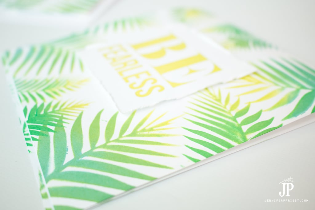
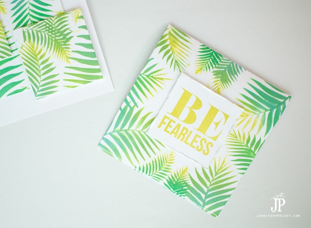
CARD 1: “Be Fearless”
- Cut a 6″ x 12″ piece of white cardstock, score at 6″ and fold to make a 6″ x 6″ card base.
- From the scraps, cut a 3″ x 3″ piece of white cardstock. Set aside.
- Lay the stencil over the edge of the card base.
- Apply a tip to the ColorBox Stylus. Press the tip into the lightest color of ink, ColorBox Chalk Ink in Lime Pastel. With a swirling motion, apply the ink to the stencil at the tip of each palm frond.
- Remove the tip and add a clean tip. Press this tip into the next lightest ink color, ColorBox Chalk Ink in Clover. With a swirling motion, apply the ink to the stencil at the bottom of each palm frond. Overlap the area with the Lime Pastel ink in order to blend.
- Remove the tip and add a clean tip. Press this tip into the ColorBox Chalk Inkpad in Serene. With a swirling motion, apply the ink to the stencil at the very bottom of each palm frond, blending with the Clover Ink.
- Continue adding layers of ink until the palm leaf looks the way you'd like.
- Move the stencil and ink another palm frond. Repeat until all of the edges of the card have palm fronds.
- Stamp the BE FEARLESS stamp onto the center of the white 3″ x 3″ cardstock square with ColorBox Chalk Ink in Lime Pastel. Use your fingernail to rough up the edges of the paper square.
- Mount to the center of the card with 3D Foam Squares from Scrapbooks Adhesives by 3L.
TIP: leave the tips from the ColorBox Stylus and Tips tool on each open inkpad to make it easier to switch between colors of ink while working. When finished, store the tips in a zip top bag with the inkpad to which they belong. Avoid wasting ink by reusing the already-inked tips again!

CARD 2: “Stacked Blocks”
- Cut a 6″ x 12″ piece of white cardstock, score at 6″ and fold to make a 6″ x 6″ card base.
- From the scraps, cut a 4″ x 4″ square, a 3″ x 3″ square, and a 2″ x 2″ square of white cardstock.
- Lay the stencil over the edge of one of the cardstock squares.
- Apply a tip to the ColorBox Stylus. Press the tip into the lightest color of ink, ColorBox Chalk Ink in Lime Pastel. With a swirling motion, apply the ink to the stencil at the tip of each palm frond.
- Remove the tip and add a clean tip. Press this tip into the next lightest ink color, ColorBox Chalk Ink in Clover. With a swirling motion, apply the ink to the stencil at the bottom of each palm frond. Overlap the area with the Lime Pastel ink in order to blend.
- Remove the tip and add a clean tip. Press this tip into the ColorBox Chalk Inkpad in Serene. With a swirling motion, apply the ink to the stencil at the very bottom of each palm frond, blending with the Clover Ink.
- Continue adding layers of ink until the palm leaf looks the way you'd like.
- Move the stencil and ink another palm frond onto the paper square. Repeat until all of the cardstock squares are covered with palm frond designs.
- Layer the cardstock blocks onto the card front and adhere into place with 3D Foam Squares from Scrapbooks Adhesives by 3L.
I hope you've enjoyed these two easy, breezy tropical cards. You'd never know they were created with STENCILS, right? And by the magic of ColorBox Chalk Ink's blending properties, we can skip the watercolors and get a soft, ombre look in a fraction of the time.
About the Author

Jennifer Priest is a 20+ year designer in the arts & crafts industry and home DIYer with a passion for creativity. An Army veteran raised on a ranch, from her experience, she shares smart DIY projects that save money and fun craft ideas that anyone can make. Besides blogging, Jennifer is a Master Practitioner and Trainer of NLP, Hypnosis, and MER, and coaches other online entrepreneurs on money mindset, business, and living an intentional life. When not blogging, Jennifer is having adventures in the wilderness, on road trips, playing with her cats, and making paleo food.


Awesome card set! I absolutely love your fresh color palette!
These are so pretty!! Thanks or being a part of the hop!
“or” should be “for.” 🙂 Thanks for being a part of the hop!
“or” where? I can’t find it.
This is awesome! You definitely captured the feel of summer! Nicely crafted! I may have to give this a try!
Hugz,
Chana
Ahhh…palms, so soothing! Great card!!
I absolutely LOVE the ombre effect with this stencil. Love these cards, just beautiful.
Gorgeous cards!
Beautiful card! I really appreciate the step-by-step instructions.
Great cards and great tips. Just stunning. I love palm trees. Thanks for hopping with us.
Love the blending you did on your palms!
Great cards. Love the stacked idea.
Really lovely! The variation of color you achieved with the inks is absolutely perfect. It’s such a realistic look!
Love, love, love your cards! I’ll be back when I have time to study your technique.
I’m in love with those great palm fronds, great mix of the shades of green
Thank you!
These are just beautiful Jennifer, I love the colours. (Clearly, I need to get myself some stencils! AND new colours! LOL)
Very cool cards. Love the tropical feel. Well done.
Great colors of ink you used on the palm fronds.
Stunning! Looking at these, I feel like I’ve been to Hawaii.
BEAUTIFUL cards Jennifer!!!
WOW – I LOVE your leaves, the colours look AMAZING and your stencil gives such a crisp image!!!
THANK YOU for sharing … I’m already a fan of ColorBox chalk inks, not tried blending them, will definitely be giving it a try now 🙂
OOOOOOOOOOOOOO! Totally in love with this!! I love all things ombre and this is a true stunner!!!
You did a wonderful job with the colors in those leaves!
Very pretty – love the colors and the super ombre effect you created !!!
Love those pretty palm fronds! The chalk inks blend so beautifully!
Love the almost Umbre look of your gorgeous palm leaves! So many terrific tips too!! You are so inspiring!
Love love love!!!!! What beautiful cards!!! The ombre effect looks so pretty done with the chalk inks.
<3 J
jwoolbright at gmail dot com
HerPeacefulGarden.blogspot.com